Ambient Pressure: Power-ups with animation

For the final post during this course I decided to talk about the power-ups and their animation. Our game include three power-ups, which are as follows.

  • Light-up: Lights up the whole screen for 3 seconds, then flickers and goes back to dark again.
  • Repellent: This works almost like an invisibility spell, it’s simply a toxic waste that masks the smell of the diver which makes them basically invisible to the enemies for a short while. The diver will have a transparent dark purple color for the duration, this will also start to flicker before it completely disappears.
  • Guiding Arrow: Simply as the name states, it is an arrow which guides the player to the nearest sample. An orange arrow will circle around the diver in the direction of the sample.

We considered it important to have each pick-up animated, to further compel the player to pick it up. It would make the whole game seem more lively. So, for the power-ups I decided to just keep an easy animation where they slowly jump back and forth, with some special animation for the light-up and the guiding arrow which will be seen below.

The first power-up that was completed was Light-up. We all basically saw it as a light in a bottle, so that is what I decided to draw. This is the final version of Light-up:

lightup

The first version of this was a lot more transparent, since I created it working from a darker background than the metallic blue we eventually went with. After feedback from the playtesting, of how it was kind of hard to spot, I made it less transparent to hopefully give a bigger contrast to the background. I am also hoping that the moving light will also aid in making it more noticable.

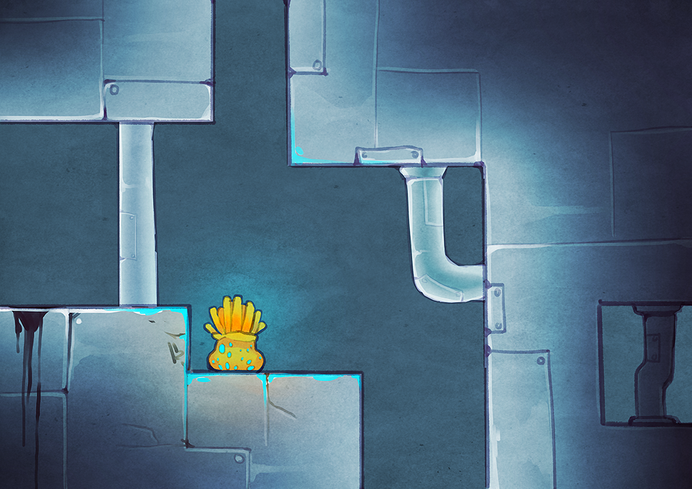
The second power-up that was created was the repellent. Designing this as something the player should want to pick up, when it is actually toxic waste was a bigger challenge than the other power-ups. We talked about having it as a flask filled with purple liquid and that’s when we decided to give the power-ups a specific appearance; they would all be in something made of glass. I decided to make the repellent as a glass jar filled with purple liquid.

repellent

The third, and final, power-up was Guiding Arrow. I had imagined it from the start as a transparent box with a bouncing arrow inside trying to get out, so after the decision of making all the power-ups out of glass; this was of course what I did. Here is the final version:

arrow

The orange arrow inside will be used as the arrow who guides the player as well, when the power-up is picked up (or ”crushed”) the arrow will escape to the outer range of the Diver’s field of vision and spin towards the nearest sample.

Ambient Pressure: Level 4 Map

Closing in on the beta deadline, I’ve mostly been working with finishing all the different maps we want to implement in the game. This week it was level 4, which turned into this:

level4

It might turn into level 3, though, says our level designer.

So, this is the second map I have made and after finishing this one I realized one thing; all the maps will look very similar to each other. It is a positive thing for me, since I could use a lot of already finished material from the first map that was created, which in turn saved a huge amount of time. The problem, though, is that it could become boring very quickly for the player to finish a map and then continue to a very similar map. That was when I had the idea of ”corrupting” the maps. My idea was to change the look of the map, as the game moves along and become harder. Each level will be continually harder than the previous and I thought we could use this to our advantage considering the design of each level. The easy leap to make from metal underwater is of course rust. So, that is what I tried out. I started doing some research of what rust actually looks like and tried to make something similar, but still according to our style. I also looked up some rust textures (completely free for use of course) and used them to enhance the effect. I showed it to the rest of the group and they also thought it would be a cool thing to do, to add some difference between each map.

The idea is that this level is where we introduce the rust, the next will have parts of rust along the whole map and it will continually grow in the spread along with each map. Eventually, the whole map will be completely made out of rust. Since I am not fully aware of how many maps we will have in the final version, I am not completely sure about how the rust will be placed on each map. I currently have 6 maps to draw, 3 of them already finished, and it will probably be a few more after that.

A problem I had this week was that we got the feedback that the map and diver did not completely match. Mainly because of the line thickness. Unfortunately this is because I was originally provided with a map of the wrong size, and drew the whole thing thinking that the diver would be considerably bigger than it actually turned out to be. I was told that it would not be worth it to redraw it, but it still bugged me when I saw it, so I knew I had to do something at least. Which means, I actually redrew all the lines for this map along with the other two that are also completed. I also shrinked most of the vegetation, to match the diver better in size. It took a lot of extra time that I had not planned for this week, but in my opinion it was worth it. It is not perfect, but it is an improvement.

Ambient Pressure: Level 2 Map

This week I have mostly been working on the design of the first map. Which later turned into level 2. This is the end result along with the level design I was given:

level2

11031119_10206081625938796_1107899349_o

My assignment was to hand-draw the map, following the structure of the level design. We chose to do our levels this way because we felt it was important for the feeling of the game to have more detailed maps, instead of regular tiles. I designed the level keeping the concept picture I drew some time back in mind, since there was nothing else specific we had agreed on with the group. Here, below, is the concept:

examplewall

The only thing that was clear about the design is that it is supposed to be underwater and probably a sunken ship. I saw  some difficulities, though, drawing it as a ship considering the level design. It is not very probable that the inside of a ship would be built so inconvenient. We had a discussion with the group and came to the conclusion that we felt that it is more important to have interesting maps rather than a realistic layout of a ship.

To somehow deal with the problem of the ship’s design, I decided to add ladders in the high areas where it would be impossible to walk or even climb. This also helps the diver in the bigger rooms, since generally people tend to keep to walls in the dark: to have something to follow. With the ladders in the middle of the room, it gives the player something other than the walls to follow when feeling lost.

I also chose to add different elements to the ship, other than the regular walls. Some vegetation was added to show that the ship has been there for some time and other decoration, such as the sign, was added to give some more interesting elements to the map. The sign and the warning lights are supposed to be slighlty lit up, which gives the player some extra vision and not just their own light and their flare gun. We thought it would be fun to add different light sources during the levels to show that this was once something functioning. It also provides some security for the player. These will have to be added as seperate objects, since it is far from optimal to animate the whole map. Animation for these items will hopefully be completeted in a later stage during the project.

The whole thing was drawn in Paint Tool Sai.