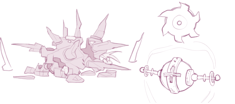
This week I will be talking about the process of how the design for the enemies were created.
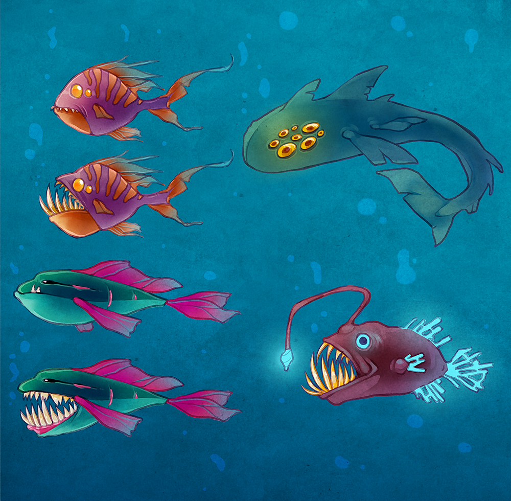
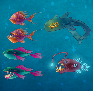
First of all, here is the end result:
How I came to this conclusion, can be read below.
We did have the concept document from the last group to go after, but I still wanted to create my own designs for our game. I used the enemies they had created and used as a base for my own ones. Which means, I kept the attributes for each fish and changed their design to better suit the style I was going for. We all decided on a simple backstory: there has been sightings of mutated fish and you have been assigned to collect samples that will tell the world what happened down there and what happened to the fish. I decided that these fish would be tropical, colorful fish. I liked the irony of the colorfulness along with the mutated look. I wanted it to be obvious that these were not created as mutated, they have once been just regular tropical fish.
I started out with the Sharptooth;
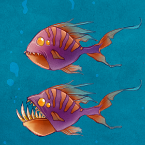
This is like the ”basic enemy” in our game. It is the weakest one out of all the others, and it is not especially scary to stumble upon, considering its small size. This was created to be 128×128 pixels big, the smallest one out of both the diver and the other fish. Its attributes is to simply patrol an area until the diver is stumbled upon. The previous group used a pinkish purple as color for this one, and I decided to do something similar. I remembered a Betta fish that I saw some time ago, a screaming purple and orange color, and decided to use that as inspiration for the color scheme. In the end, it turned out a lot less colorful to not completely loose the scary feeling.
The next enemy I started working on was the Slowfish;
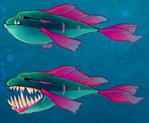
As can be noticed in the name, this fish is slow. It would also be considerably bigger than the Sharptooth. It was decided to use a 256×256 pixels big sprite for this enemy, just as big as the diver actually. Keeping this in mind, I started designing the fish. Because of its slow movement I wanted the body to be big and not very flexible. I also wanted it to have a more oval look than the Sharptooth, to give it a bigger feeling. I originally started out with a blue and pink color scheme, but considering the blue water, it could be more difficult for the player to spot it. So, a more green-ish blue was used for the body.
And the biggest fish among them, the Diafol;
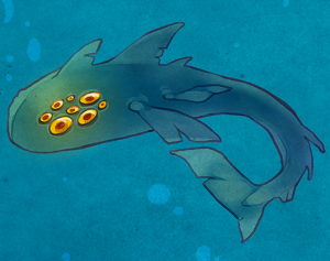
We decided to incorporate this fish in our game as a final boss. It will be shown throughout the levels, hinting of its existence, until the last level where it will be all about escaping from it. This would be the biggest and baddest fish in the game, so I naturally designed it keeping sharks in mind. It’s not much to the design other than the shark-like features and mutated look. This one was also originally supposed to be blue, but was changed to a more green-ish blue, for the same reasons as previously mentioned. To give some contrast, the eyes are yellow.
And the last one of the bunch, the Creeperfish;
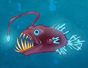
This was not a part of the previous group’s design document, but created by me. I wanted to add a fish that could really play and lure the player. The first thing that came to mind was of course the famous anglerfish. The design is based completely on that fish, with a dark color scheme to hide the body even better in the dark. I decided that the glowing elements would be a bright blue, a fairly neutral color, to use as the lure for the player. The glowing elements in the samples will be the same color, which will give the player a challenge to tell them apart.